
Signals of Change
In the first decade of the 21st century, the search world was easy. Every internet search was performed on a desktop device. The use of internet connections on mobile devices was limited to downloading funny wallpapers and polyphonic ringtones through paid SMS services, advertised at the back end of glossy magazines.

With the introduction of smartphones and tablets, the mobile search market started to grow and after a few years, it was clear that it was just a matter of time before it would overtake the desktop hegemony.
Today we find ourselves in a world where most search queries are sent from mobile devices with screens vastly different in terms of size and proportion from desktop displays, inferior processing power, and often with slower internet connections.
Web developers and search engines had to adapt to this change, and serve mobile users with mobile-friendly content, designed to fit onto a screen that you can carry in your pocket.
But that’s not enough.
There’s little reason (other than historical) to keep search algorithms desktop-oriented, and Google is making the switch to mobile-oriented algorithms right now.
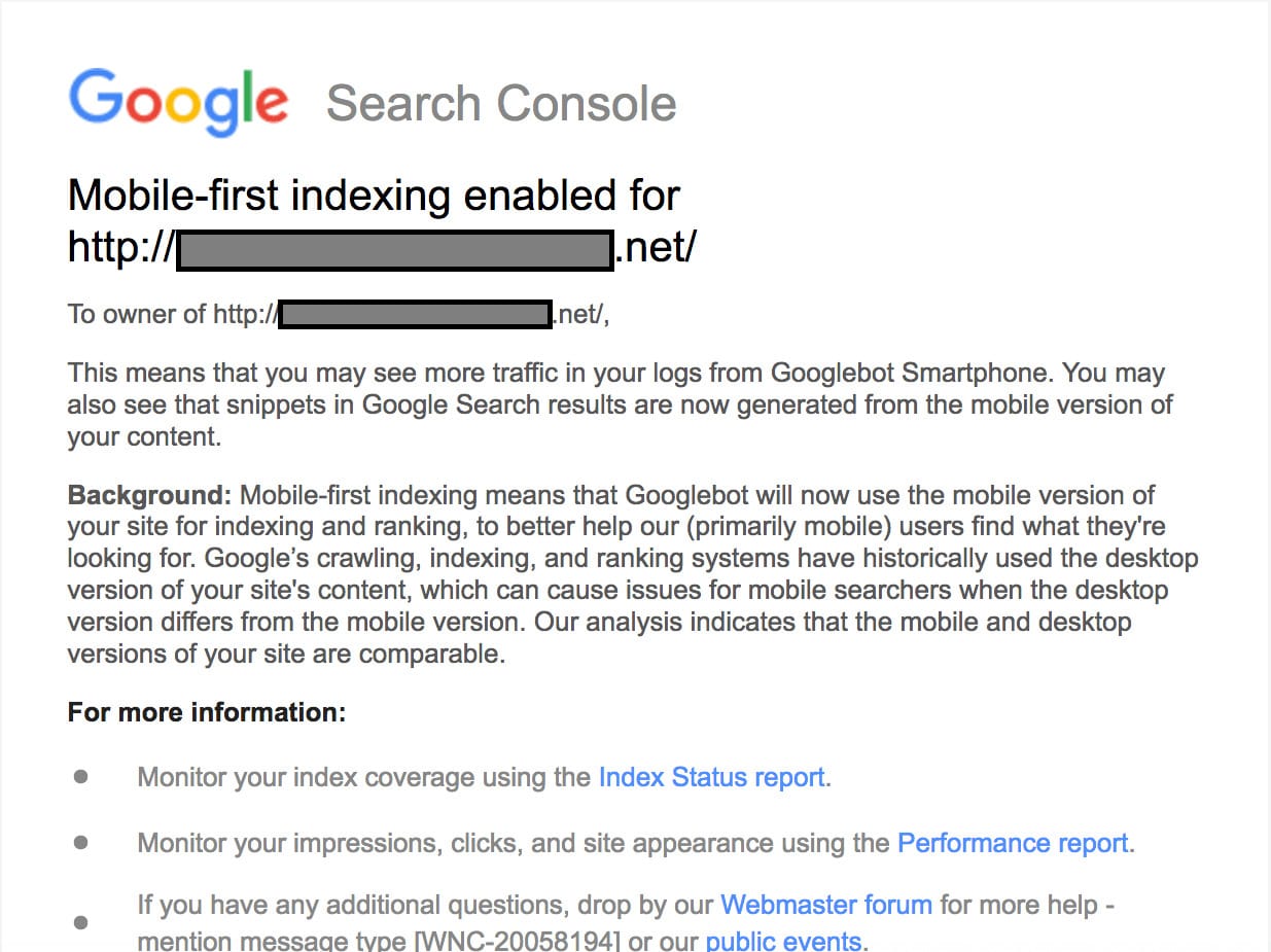
The first signal of the incoming Google Mobile-first indexing appeared around the end of 2016 in the form of an announcement. In December 2017, the topic was brought back by Google as a “last warning.”
Then, at the end of March 2018, Google stated that migrating sites to mobile-first indexing had begun.

For Everything to Stay the Same, Everything Must Change
What is Mobile-first Indexing About?
This change is about how Google perceives the web. Currently, Google discovers your content in the way it’s presented to desktop users. However, with the Mobile-first Index this will change, and Google will be looking primarily at your mobile site.
From a technical point of view, the User Agent determines whether a server request will be treated like a desktop or mobile user. Currently, the most frequently used GoogleBot crawler is the desktop one. Here’s the User Agent:
Mozilla/5.0 (compatible; Googlebot/2.1; +http://www.google.com/bot.html)
It discovers new URLs by following links and parses the content it finds. It’s accompanied by specialized crawlers such as image-bot, ads-bot, or mobile-bot, which support the desktop crawler with parsing specific content. The data is then sent to the indexer, which ‘remembers’ what’s on a given page.
After the update, Google will be more interested in your mobile pages, therefore you should expect to see more requests coming from the mobile GoogleBot. Here’s the User Agent:
Mozilla/5.0 (Linux; Android 6.0.1; Nexus 5X Build/MMB29P) AppleWebKit/537.36 (KHTML, like Gecko) Chrome/41.0.2272.96 Mobile Safari/537.36 (compatible; Googlebot/2.1; +http://www.google.com/bot.html)
Google promised to be cautious with rolling out the process of the update and it began switching to Mobile-first only for those sites which were ready.
In March 2020, Google rolled out an important update stating that all websites would be moved to mobile-first indexing starting September 2020. This dateline was prolonged to March 2021, giving website owners more time to adjust their sites.
The second deadline was canceled in November 2021 after Google noticed that some websites were facing unexpected problems and were not ready to switch.
Nevertheless, I believe that the change is inevitable and will come to all websites sooner or later. Regardless of the update, the content parity audit described in this article is something you should include in your SEO strategy anyway.
Is My Website in the Mobile-first Indexing?
Who Should Worry about the Update?
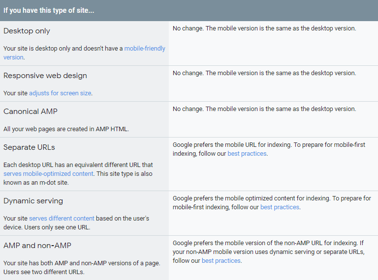
Websites with different mobile and desktop versions should worry about the update, mainly sites with separate mobile URLs. On the other side of the spectrum are websites with responsive design. Well-implemented responsive design guarantees content uniformity across all platforms.
Are your alternate/canonical tags implemented correctly (also on mobile)?
Are the desktop/mobile redirects implemented correctly?
So to recap: Is your mobile site following Google’s Best practices for mobile-first indexing?
If you can answer these questions, that’s great! That means that you should possess the correct knowledge in order to make a judgment. If not, I’m going to emphasize the biggest risks related to this change. I’ll also show you how to perform the Content Parity Audit later in the article, which will help you spot the differences between your desktop and mobile site.
What Will Change with the Mobile-first Index?
The first big change, already confirmed by Googler John Mueller, is in regard to hidden content. On a desktop, when you have content hidden under a tab, it’s indexed differently and Google treats it as less important than plainly visible content. However, on mobile devices the smaller screen size forces developers to use these tabs in order to avoid flooding users with text, so Google will act accordingly and should accept such content with full value.
Another one is the site structure. Mobile pages often have a limited amount of links in the navigation compared to their desktop equivalents. Some menus don’t go as deep, and some are simply cut in order to fit on a smaller screen. Along with changing the User Experience, this changes the PageRank flow on the site as well. If you don’t provide the same link structure on your mobile site as on your desktop site, you might see ranking changes.
Audit the Mobile Version of Your Website
Make sure your SEO tags are implemented properly. Pay attention to the canonical tags, hreflang settings, meta tags, and structured data. It’s extremely important that Google can process the information contained within those data structures.
Many developers focus on implementing structured data (e.g., json-ld, schema.org) only for desktop pages. But if you’re in a situation where your desktop and mobile sites are separate, you have to make sure that the Mobile Googlebot sees the structured data as well. Google recommends to keep it on both the desktop and mobile versions of the page.
Separate URLs for Mobile Site
This is a common implementation for mobile sites, so I’d like to elaborate a bit more on how to properly configure meta tags on these kinds of sites, because they are often not very well optimized. The most common type of implementation is a mobile subdomain, like m.example.com.
Obligatory elements:
- rel=”canonical” link on every mobile page that points to the desktop equivalent of that page.
- rel=”alternate” link on every desktop page that points to the mobile equivalent
The URL pairs should be unique: this means that each mobile page should have exactly one canonical desktop version, which should also link to the mobile version with a single rel=”alternate” link.
If you target multiple regions and/or languages, you should use the rel=”alternate” hreflang=”x” tags. For more general info on those tags visit Google support page. Here I’ll focus on how to deal with those tags on mobile subdomain pages. Let’s say, we’ve got a page available on 4 URLs: English desktop (example.com), English mobile (m.example.com), Polish desktop (example.pl), and Polish mobile (m.example.pl)
- Use hreflangs on the desktop versions of the page: example.com should contain a hreflang pointing to example.pl and vice-versa, the Polish page should point to example.com with a hreflang tag.
- Use hreflangs on the mobile versions of the page. m.example.com should contain a hrelfang pointing to the mobile version of the Polish page: m.example.pl, and vice-versa, m.example.pl should point with a hreflang tag to m.example.com
Find out more about hreflangs and international SEO as a whole in our Ultimate Guide to International SEO.
Deal with Immediate Threats First
The very first threat that you should deal with is the risk of non-crawlability. It’s the most basic need for your website.
Perform a Content Parity Audit
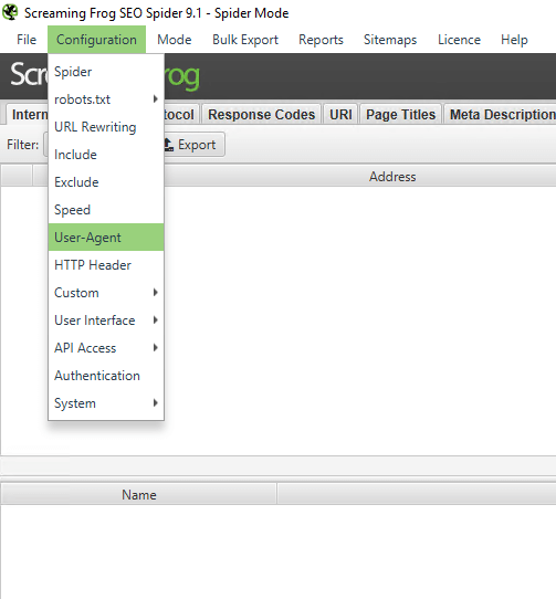
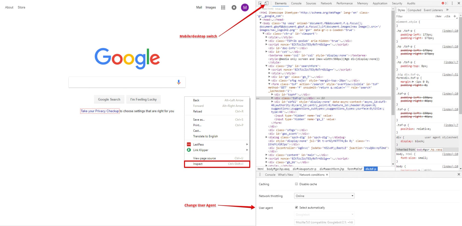
In order to ensure crawlability, you should, well, crawl your website as a mobile user in spider mode. Pretty much all modern crawlers have the possibility to change the user agent. Make sure to perform a crawl with a mobile user agent and compare it to a desktop-driven crawl.
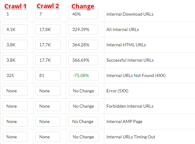
While you do the crawlability check, you should also do a content parity audit. Check the most basic parameters: number of pages, number of indexable pages, noindex tags, robots.txt settings, number of words on pages (note that changes in navigation and source code might perturb the last metric, treat it as a suggested measurement). Make sure that nothing blocks the mobile crawler from accessing your website.
Gather More Details About a Specific Page
You can also compare the source codes of your desktop and mobile pages using a text-comparing tool, like, for example, Diff Checker. If you have a different HTML document for your mobile and desktop versions don’t expect the code to match exactly, but rather look for specific parts.
Example Not to Follow
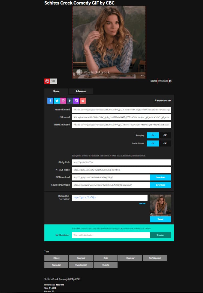
A good example of a completely different linking structure on mobile and desktop versions of the site is Giphy:
| Desktop | Mobile |
|---|---|
 |
 |
Follow Google’s Mobile-friendly Guide
Mitigate the Long-term Effects
We do not have exact knowledge of what the index will look like after the switch, but we can expect to see some large-scale changes. Those effects might show up in the long term but are not guaranteed to occur.
One is the page speed impact. Mobile users are more vulnerable to website performance issues because the average connection on mobile is slower than on desktop. Users are usually very impatient if it takes ages for a website to load. In fact, Google is taking steps to increase the effect that page speed has on rankings. In July 2018, page speed became a ranking factor for mobile devices. Helpful tools in the Page Speed analysis are Google’s PageSpeed Insights and WebPageTest.
Another supposed long-term change may be the PageRank flow in the scale of the entire web. It’s very unlikely that Google will choose to switch to a Mobile-only Index, and ignore desktop-only links altogether, but there might be a different approach to links present on both versus desktop-only links (and that’s a significant portion of external links today). This might lead to a change in the large-scale flow of PageRank, which might cause ranking fluctuations.
Tied to the PageRank flow, there is another big factor that might change: the backlinks. Websites tend to link to external sources more freely on the desktop versions of their pages than on mobile, where every bit of space is worth its weight in gold. With Mobile-first Indexing Google might drop the value of desktop-only backlinks. Although this is just speculation, you might want to pay attention to the mobile backlinks as well and check whether your precious, high-quality backlinks are present on mobile.
TL;DR
At the end I’d like to present a simple checklist for you to take. If you’ve got it covered, you can calmly wait for the mobile index message in your Search Console.
- Check your website crawlability on mobile (with a smartphone User Agent).
- Make sure all your important links are present on mobile.
- Make sure all of your important content is present on mobile.
- Check whether meta tags, canonicals, hreflangs, and structured data are implemented correctly on mobile.
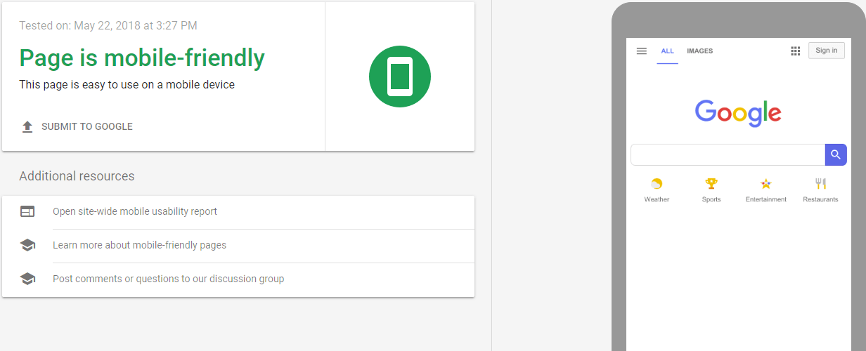
- Make sure your mobile site is actually mobile-friendly.
- Make your website (especially the mobile version) fast.
- Try to ensure indexation of important backlinks to your website after the Mobile-first update.
Or get a responsive design if you can, that’s what Google and Users want in most cases.
We provide all those solutions and more during our mobile SEO services. Still having questions or concerns? You can discuss them with Onely’s technical SEO experts.


