In our second major campaign for Morizon, one of the leading real estate search websites in Poland, we decided to listen to our audience and give them a much-needed voice.
After two years of working with Elephate, the Morizon.pl blog has become a website packed with useful information about renting (and renting out) apartments. Among the dozens of articles and posts we have published, there are plenty of useful guidebooks, insightful tips, and essential legal advice — both for tenants and landlords. We made sure they answered all the most important questions and thus ranked high in the Google search results.
But that wasn’t enough for our content team. We wanted to get a more in-depth look at Poland’s rental market and, once again, prove that Morizon is a trustworthy brand that not only informs, but listens too.
Here’s how we did it.

Polish Tenants And Their Problems
Apartment rental in Poland is hugely underdeveloped and suffers from numerous problems. To identify as many of them as possible, we decided to reach tenants from across the country and ask them about their experiences with renting a room or apartment. By gaining their perspective, we wanted to distinguish the myths that have been circling the whole process (e.g. pictures of ugly rentals in Poland which are a hit on Facebook) from reality.
We created a questionnaire that covered every single element of the rental process — such as searching for an apartment, looking at properties, dealing with landlords or living with roommates. Though most questions were closed-ended, we allowed our respondents to add answers of their own. We didn’t want to miss the chance to get a broader view and catch a perspective we might not have considered.
At the very end of our questionnaire we also put “Anything to add?” hoping to encourage tenants to share their own real-life stories.
Finding Respondents
Now that the survey was ready, we had to reach our respondents.
Since most of our content team went through the rental process at some point in their lives, we knew exactly how to reach tenants from all over Poland. There are at least a couple of Facebook groups where people share their offers and requests for every major Polish city. That’s where we could find the respondents for our study.
However, timing was crucial.
We decided to run our survey in late August, when most students were intensively searching for rooms and apartments to rent in preparation for the upcoming semester.
It worked — in just two weeks we gathered 2,670 responses!
Writing the Report
Now that we had our data, it was time to write. We wanted to present the results in a report that would draw attention and directly address most of the tenants’ problems.
In order to provoke a discussion and convey emotion, we decided not to be 100% objective and took the tenants’ side, knowing that in the future we would be launching a follow-up campaign aimed at landlords. To build more credibility, we supported the survey results with official data from Eurostat and the Central Statistical Office.
“Well, OK, but numbers are not especially exciting,” you are probably thinking. Remember that “Anything to add?” question from our questionnaire? It turned out that our respondents were more than eager to share their stories — we received over 200 of them! By picking a dozen (some funny, some outright terrifying) and including them in the text, not only did we find a way to engage our readers, but also quite literally gave Polish tenants a much-needed voice.
Graphic Presentation
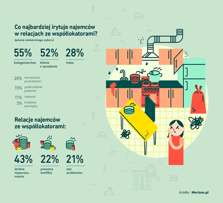
By now you’ve probably noticed that our report is a mixture of rational data and emotional voices. The graphics follow the same approach.
Data presentation can’t be boring. It should be appealing and complement the text.
That’s why next to our survey results we put three cartoon characters, each dealing with a different side of a problematic tenant experience. Even though at first glance the graphics seem colorful and friendly, the expressions on those three faces send a rather different message.
You want to know what’s wrong, and the numbers right next to the illustrations explain it.
Promoting the Content
Aside from Morizon’s Facebook page, we focused on promoting our report mostly on three types of websites: economy and real estate related, as well as local news. For each of those types we created a different press release.
When reaching out to economics and real estate websites, we put an emphasis on the data and conclusions that we found most-fitting to their field of interest.
The press release for the local news websites was a bit less analytical, as it focused on the most newsworthy parts of our report. We also included the average rent prices for each website’s respective city.
Effects
- 61 dofollow links
- 19 nofollow links and brand mentions
- Facebook reach: 606,908
Key Takeaways
- Know your audience… During our two-year-long relationship with Morizon, we’ve learned a lot about tenants, which are a huge part of the blog’s audience. We researched the subjects we thought they wanted to know about and read their comments. In preparation for writing our report, we also asked our friends about their experiences with renting apartments.
- …and let them say something. Always look for an opportunity to give your audience a voice. They have their share of problems and things they want to talk about. It’s just that most of the time nobody cares to listen.
-
Personalize your press release. In the age of the Internet, journalists have to work even faster — especially those publishing online. By sending a press release that is carefully adjusted to the subjects they cover, you make their job a bit easier and increase your chances of getting published.